The informative data visualizations that are shown provide a thorough analysis of the demographic and socioeconomic dynamics that exist inside a certain region, which is most often an urban setting that is divided into wards. The following analyses is based on Washington DC public data. Numerous socioeconomic variables are included in these visualizations, such as household compositions, income categories, education levels, racial demographics, population density, poverty rates, household density, reliance on public transit, and unemployment rates.
Analysis of Household Dynamics
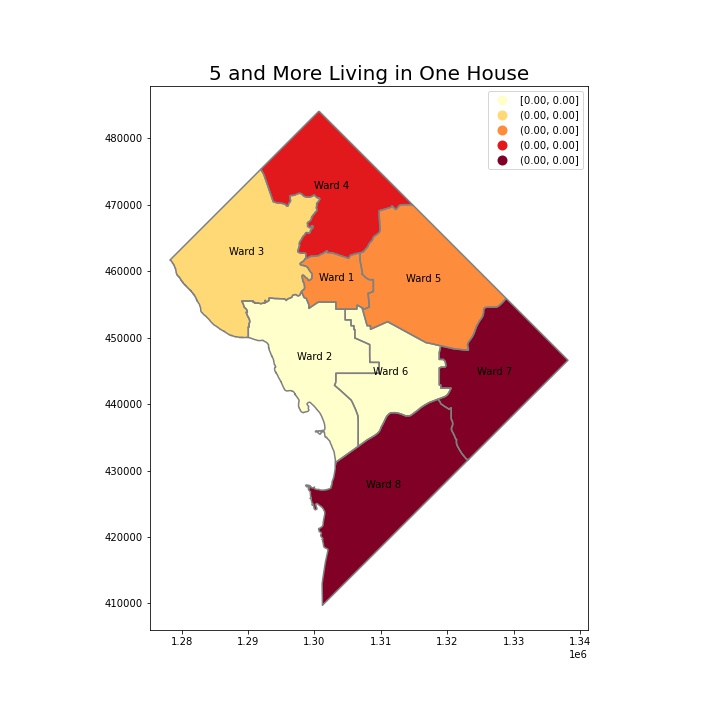
The area with perhaps greater family sizes or shared living arrangements is highlighted by the visualization of households with five or more people. The ramifications are extensive and include anything from social support networks to possible difficulties in granting sufficient living space and privacy.
Academic Achievement and Its Consequences
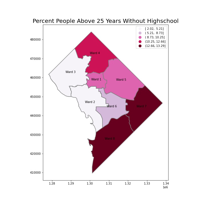
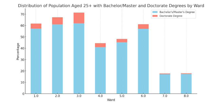
The education level graphic, which shows the proportion of people over 25 who do not have a high school diploma, provides important information on the population’s educational makeup. One important factor that determines socioeconomic position is educational achievement, which has an impact on income levels and employment prospects.
Household Income and Size: Two Viewes
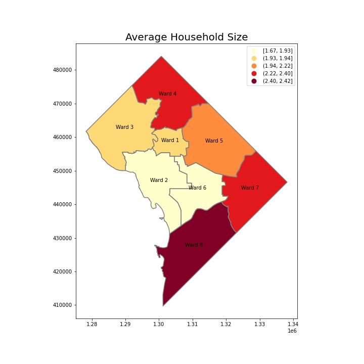
A picture of wealth distribution and living standards is created by contrasting the average income visualization with the average household size map. Higher earnings and smaller households usually suggest better resource allocation per person, which is frequently linked to higher quality of life.
Poverty and Family Density: Examining Financial Difficulties
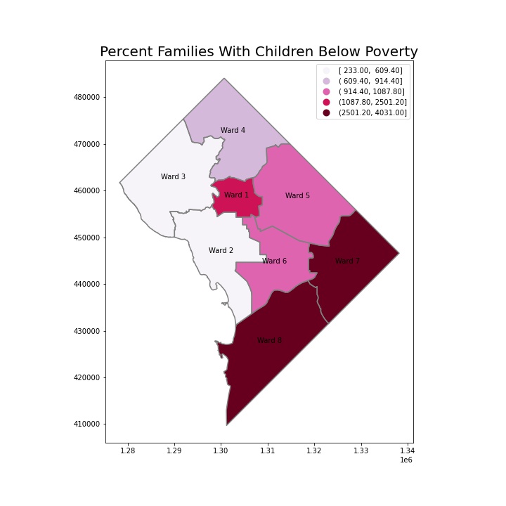
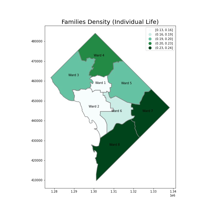
Economic gaps are made clear by the family density visualizations and the percentage of families living below the poverty line. High family densities and rates of poverty can be indicators of socioeconomic distress and the need for focused social services and programs for economic growth.
Racial Composition: A Glimpse into Diversity
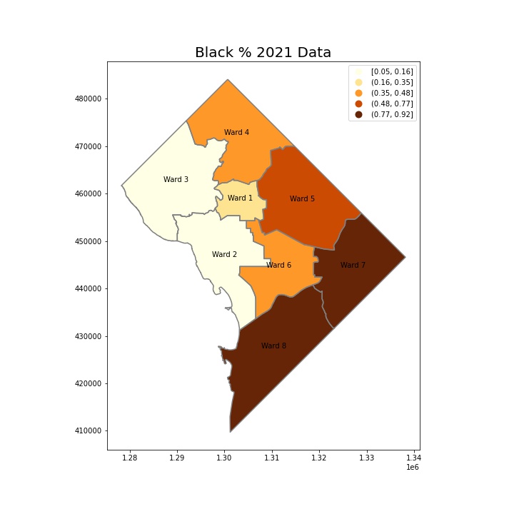
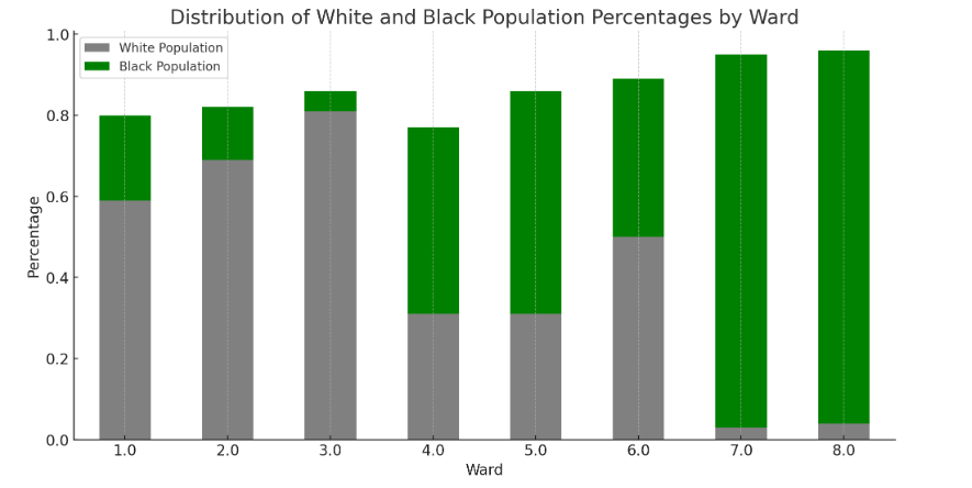
The area’s variety is demonstrated by the racial demographic breakdown, particularly the proportion of the Black population. town dynamics, social policies, and cultural vibrancy can all be impacted by the racial mix of a town.
Population Density: A Geographic Examination
The map of population density provides evidence of the patterns of habitation and urban planning. Densely inhabited areas could be indicative of suburban or undeveloped zones, whilst sparser parts might represent a booming metropolitan core.
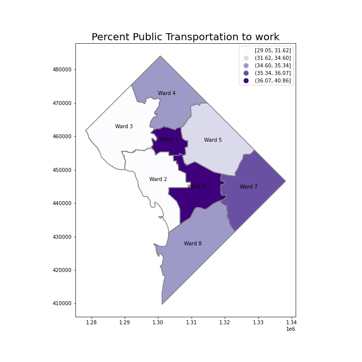
Public Transportation to Work: An Examination of Urban Mobility
The infrastructure and urban mobility are impacted by reliance on public transportation for transportation. A high dependence on public transportation may be a sign of either well-established transit networks or a deficiency of private transportation options, each with unique consequences for urban design and the environment.
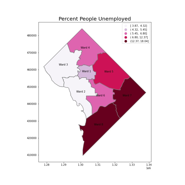
Unemployment Rates: The Measure of the Economy
Finally, the unemployment rate graphic is an important economic indicator. Low unemployment rates could be a sign of a thriving job market, while high rates might be a sign of economic stagnation.
Final Thoughts
Together, these visualizations give researchers, urban planners, and legislators vital information they need to make decisions that will improve living conditions, advance fair economic growth, and promote community well-being. They emphasize how crucial it is to approach social welfare and urban development from a nuanced, data-driven perspective.


